

PROJECT 02 · GEZEL
Gezel
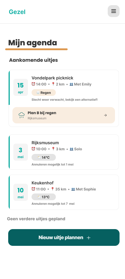
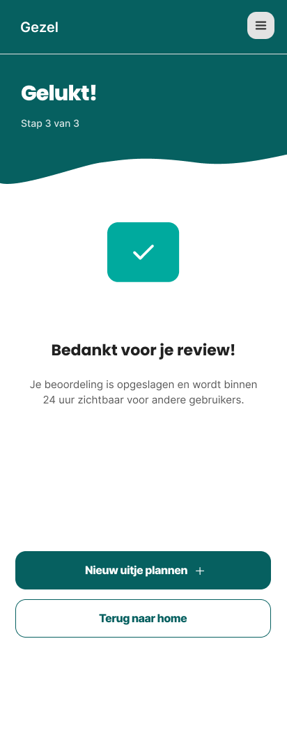
An Android app that recommends outings based on users' personal preferences, mood, location, weather and available time.
ROLE
UX/UI designer
TIMELINE
Feb – May 2026 · 11 weeks
TEAM
Concept with 6, app solo
TOOLS
Figma · prototyping


01
THE BRIEF
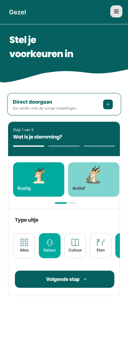
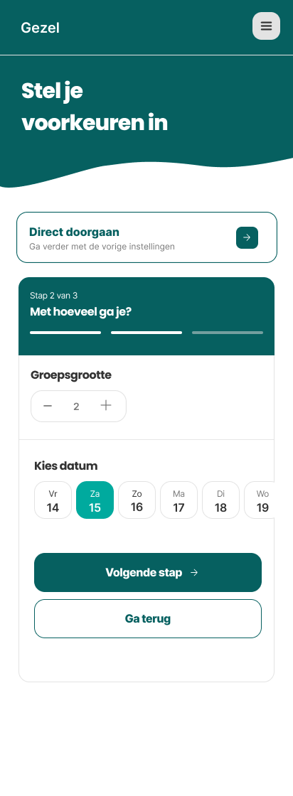
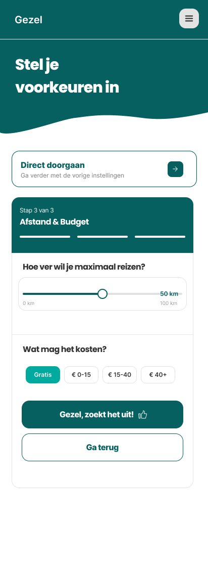
For the course Persuasive Context Aware Design, our team of six each independently designed an outings app for Generation Pragmatists. The goal was to create an app that considers the user's preferences and situation, including mood, location, time, budget and weather. Together, we researched the target audience and their needs. Based on our shared findings, I independently designed the complete app, focusing on its key functionalities and persuasive prompts.
KEY INSIGHT
Having more options isn't helpful when they don't match what pragmatists are looking for.
THE QUESTION
How might we create an app that matches pragmatists’ needs without overwhelming them with choices?
02
THE PROCESS
From a shared concept to a complete, clickable app in eleven weeks, with persuasive design behind every screen.
01 · RESEARCH
We used different research methods, including cultural probes, interviews, desk research and competitor research, to understand the needs, preferences and decision-making of Generation Pragmatists.
research methods
02 · IDEATION
Together, we translated our research insights into user stories and acceptance criteria, defining the key needs and functionalities of the app.
acceptance criteria
03 · DEVELOPMENT
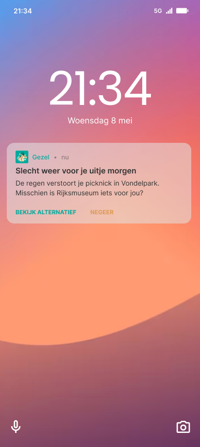
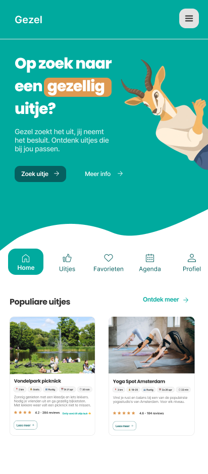
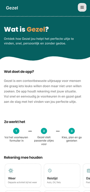
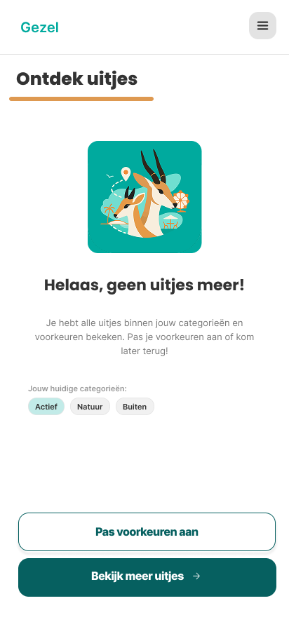
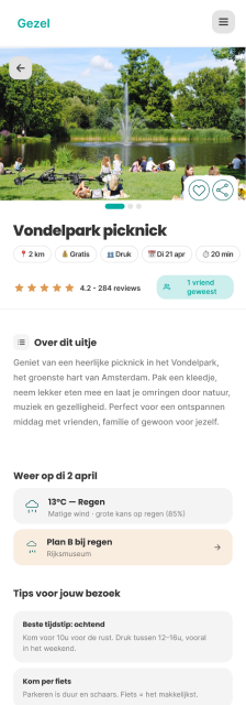
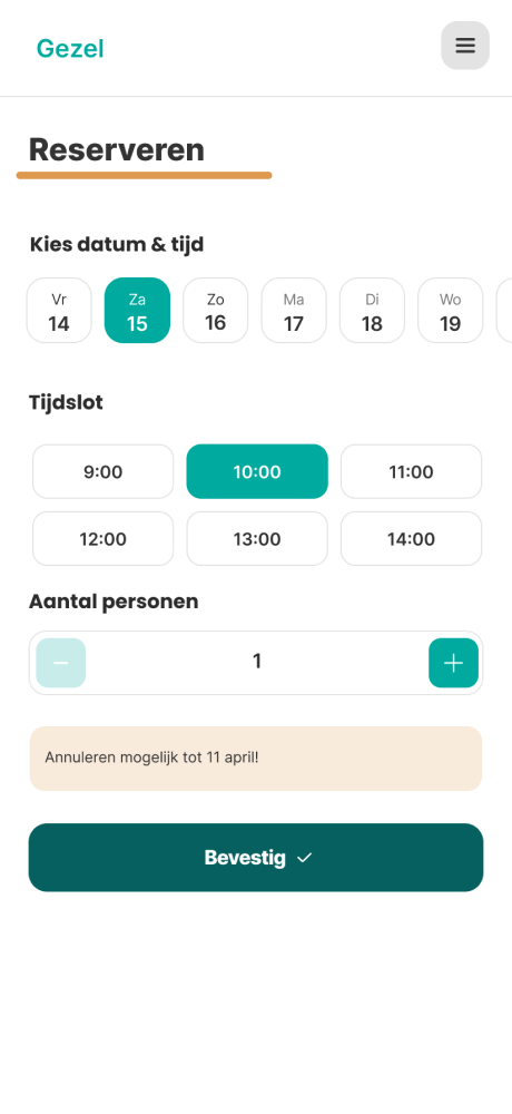
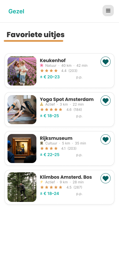
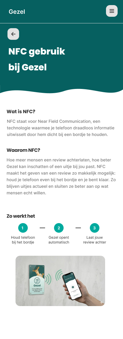
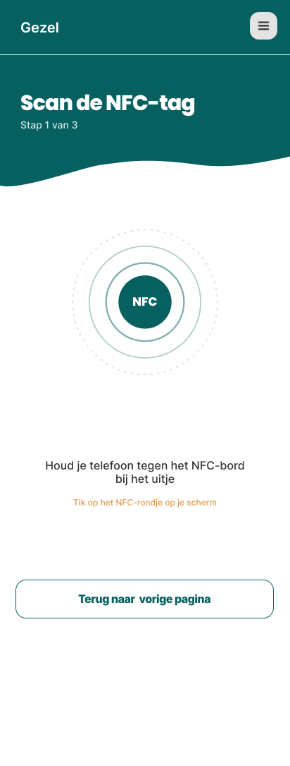
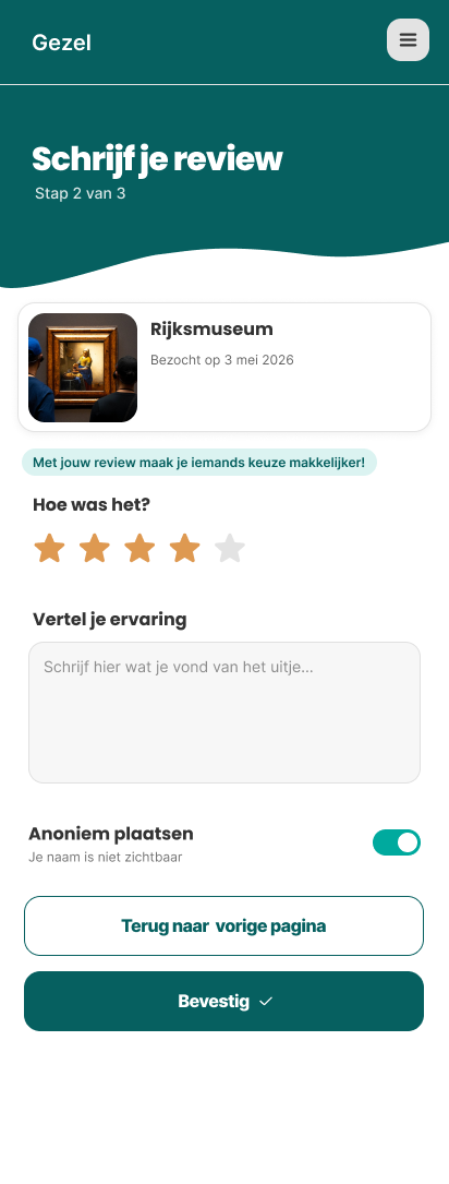
We designed the app using our acceptance criteria as a foundation, incorporating persuasive design prompts throughout the screens and using our shared stylescape to create a consistent visual identity.
screens
including 10 persuasive prompts
03
STYLE & IDENTITY
Calm, clear and trustworthy.
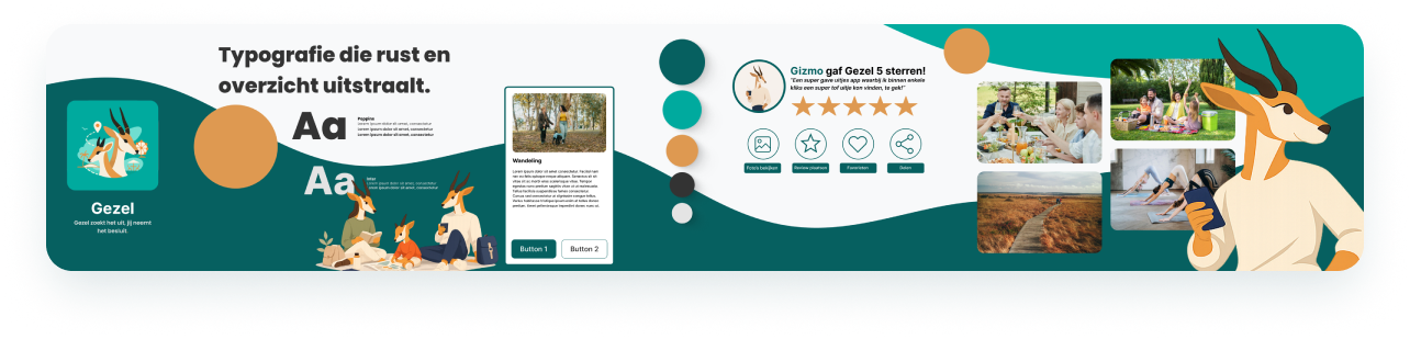
The stylescape we created as a team.
Every individual app had to follow it when designing the app.
TYPOGRAPHY
Clean, simple letterforms (Poppins and Inter) that read easily and give the app a sense of calm and order.
MASCOT
The gazelle gives Gezel a recognizable and playful identity. The character makes the app visually appealing, approachable and personal.
COLOUR
Deep blue-green with a warm orange instead of standard green, for high contrast, clear buttons and a feeling of trust.
04
THE RESULT
Gezel figures it out, you make the call.
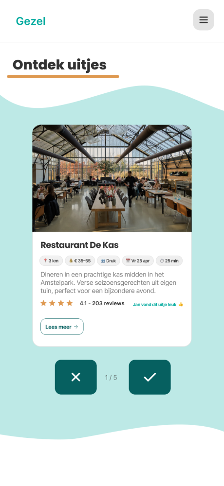
Click the outing to find out more
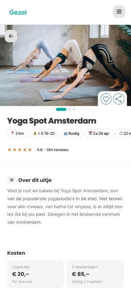
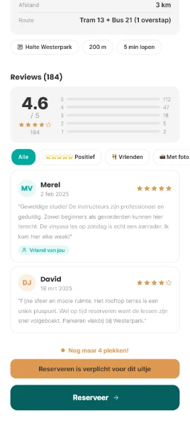
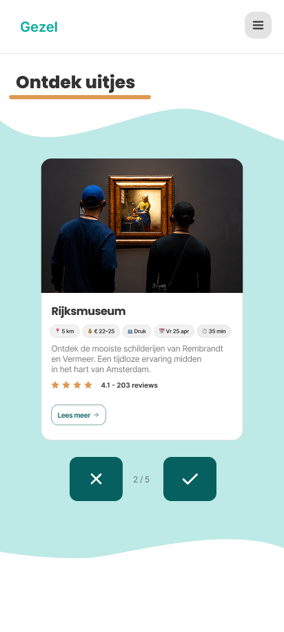
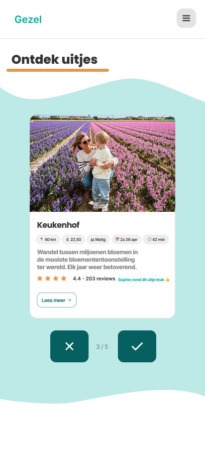
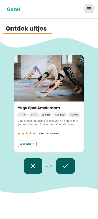
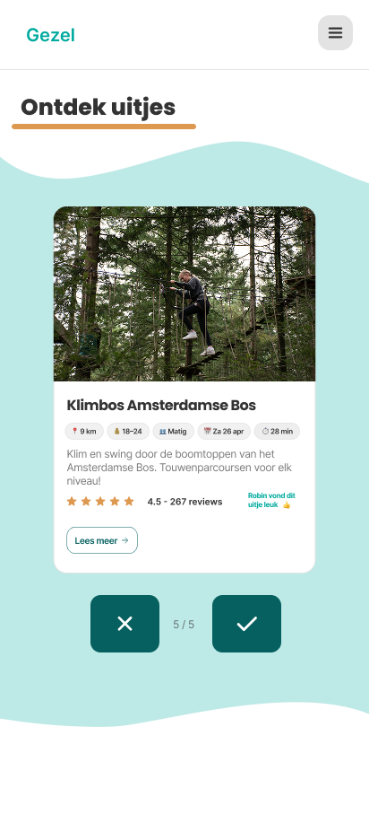
My swipe module was inspired by the intuitive swipe functionality of popular dating apps. Users can swipe right to save activities they like or left to skip them, making it quick and easy to explore different options. By tapping on an activity or the button, they can access more details. The module is designed to create a seamless and engaging experience, allowing users to discover activities that match their personal interests and preferences.
05
WHAT I LEARNED
“Small nudges make a big difference.”
This was one of my most challenging CMD projects so far. I had to design a complete, clickable user flow in Figma, making sure all design requirements and acceptance criteria were integrated throughout the app. With over 20 acceptance criteria to consider, this meant designing and connecting many different screens.
Another challenge was applying persuasive prompts based on the book Online Invloed by Bas Wouters and Joris Groen. I had to carefully consider which prompts to use, where to place them and how to justify each choice using the theory from the book.
SKILLS USED
NEXT PROJECT →
fashion minor
Fashion & Entrepreneurship · AMFI Amsterdam